Oct 15, 2009 4
FUrniTURE: Joris Laarman’s Bone Chair
The chair, probably more than any other single object, is how a designer sets herself or himself apart, pushes the boundaries of design, and defines his or her personal style. Every major designer has their own chair design, or several — even architects get in on the fun by designing chairs especially for public spaces within their major edifices. It’s like a Zen rock garden or a haiku; the simple but rigid boundaries that define the object free the imagination. Going through the first two links above never ceases to amaze me with the innovation and sheer breadth of possible designs that still manage to adhere to specific constructs. Just when you think you’ve seen every conceivable chair design … you haven’t.
But one particular chair design stands above all the rest in my mind — not because it is especially beautiful (although it is beautiful), or even especially clever (although it certainly is clever), but because it represents an entirely new approach to design. Given the endless variety of forms in which the chair has been incarnated, a truly original approach is surprising indeed. It doesn’t end there: it’s not originality for the sake of originality. More than that, it represents a practicality and economy of design the likes of which we are only just beginning to imagine.
![]()
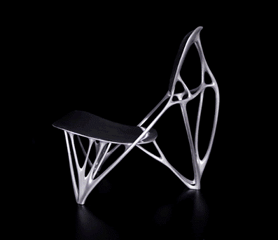
 If you’re not familiar with the Bone Chair, here’s a little background. For starters, an image of the chair is at right. You can see it’s weird looking, but not that weird looking. The appearance is just the beginning. The design of the bone chair actually began back in 1998 when Adam Opel GmbH, a German General Motors subsidiary, developed new imaging and simulation software with the intention of creating a more efficient engine mount. In 1998, computer aided design was still in its infancy; this was among the first times that a three-dimensional model of a future production design was created in computer simulation, then tested and modified based on the results of the simulation. A simple idea, one we take for granted now, but back then it was cutting edge, and even today we have barely scraped the surface of its potential.
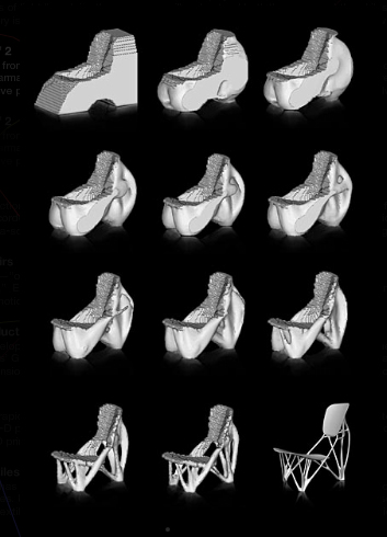
The purpose of the engine mount design software was to fix specific elements in place (after all, this was just one part of an engine, and the rest of the engine parts have to be positioned in relation to one another) while providing optimum strength using a minimum of materials. This is done by creating a virtual three-dimensional model and simulating the application of stress to specific points on the engine mount. Then, the parts of the mount that bear less stress are “stripped away.” This process is repeated through several generations, as the link above demonstrates, and the final result is a design that approaches maximum efficiency in trading off strength and economy of materials.
What’s striking about this process is that it is the very same process used by living organisms as they grow, in response to stresses from their environment. In particular, bones — which give the chair its name — grow more dense and strong in areas where they are subjected to repeated pressure. The arcs of their spongy internal structure are perfect for distributing forces away from a fulcrum. Areas that endure strain — the leg-bones of joggers, the arm-bones of boxers — are built up over the years, until the bones themselves are reinforced in the areas that need it. Likewise, bone that is never stressed atrophies as resources are used elsewhere, leaving the bone lighter.
As the designer of the Bone Chair, Joris Laarman, says: “Trees have the ability to add material where strength is needed. But bones also have the ability to take away material where it is not needed.” Through the evolutionary process, our bones find the ideal tradeoff between strength and efficiency, between reinforcement and weight, through constant and responsive change. The software designed by Adam Opel GmbH replicates the same process: repeated generations of the simulation add material where strength is needed, and chip away material everywhere it is not, creating a design that achieves maximum strength with a minimum amount of material.
![]()
The issue of digital versus analogue information is only tangentially related to design, or perhaps not at all related if you want to be perfectly literal about it, but it has a certain symbolic relationship to the bigger picture into which I’m trying to fit the Bone Chair.
We equate “analogue” with vinyl and cassettes: easily-degraded, hissy-sounding formats. Or clock faces with sweeping hands that never point directly to the number, but are always pointing to one of the infinite number of sub-divided gradations between those numbers. Digital information, on the other hand, is encoded in zeros and ones, binary extremes, making it robust and insusceptible to degradation. CDs and mp3s always sound as clear as the original studio recording; digital clocks always quantize the time into nice whole numbers.
This belies the fact that analogue formats actually hold vastly more information than digital ones. To illustrate this, I turn from music and time to imagery. We all know (all of us, that is, except writers of TV procedural dramas) that when you blow up a digital image enough, all you get is a series of pixels; there’s a threshold below which there is not just diminished information, there’s no information. An analogue format such as celluloid, on the other hand, can be blown up indefinitely. There’s a loss of image resolution, and a graininess, to be sure, but in theory, at least, the detail is not inherently limited by the format.
Researchers in the world of information management have been exploring the possibility of analogue computation and data storage for years — decades, even. Because it’s not limited to a finite number of bits set to zero or one, but uses bits that can hold any value along a sliding scale between zero and one, the increase in potential power or storage is virtually unlimited. In fact, just comparing the human brain — an analogue computational device — to a conventional digital computer demonstrates that there’s no contest; the complexity and volume of processing power of the human mind blows digital computers away.
Digital definitely has its advantages — after all, infinite resolution is a waste of resources when operating on a scale of finite capacity. There are only so many pixels on a TV screen, so it makes sense to switch TV broadcast from analogue to digital to free up more bandwidth. But in other situations, such as logistics or manufacturing, the ability to approach infinity, and especially infinite efficiency, is a good thing.
![]()
The Bone Chair was designed using the same CAD software Adam Opel GmbH used to create its high-efficiency engine blocks. Essentially the designer predetermined where the seat and the back of the chair would be, as flat surfaces, and predetermined the three points on the ground where the chair would rest (the points that would bear the load), and let the computer do the rest. There was some tweaking involved, in order to achieve a pleasant-looking chair, but essentially the lines of the chair were determined by the software according to the parameters of position and load bearance.
 With the chair’s seat, back and feet in place, all that remained was to remove anything else that wasn’t necessary. The image at left illustrates how the software, starting from a block, chipped away at the structure, removing material from where stress was not applied or transmitted.
This is exactly the same process our bones use to strengthen and reinforce areas under stress — through generations of stress and response. The Bone Chair, therefore, takes on an organic appearance. It resembles structures found in nature honed to hyperefficient form by eons of evolution — and is, in fact, the result of evolution proceeding through generations of computer simulation.
The design of the chair was just the beginning, of course, but ironically, the fabrication of the physical chair was completed using the very old technique of casting, the same basic technique used by sculptors of antiquity. As a physical object, the chair came to be using a technique called 3D printing, which used the computer model to create a ceramic mold. Molten aluminum is poured into the mold, cooled, and the mold is smashed open. Then all that remains is to trim the excess aluminum from the cast chair and polish the metal surface — a process achieved entirely by hand, a very labour-intensive process. For this reason there were only a dozen manufactured during the first run. I have been unable to find a price; presumably they were all sold at auction for more money than I make in a year.
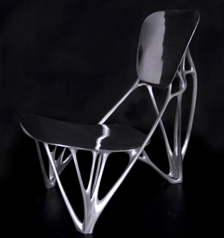
The chair looks solid, but the metal of the frame is hollow inside, with sides only about a quarter of an inch thick — it has been described as “ephemeral and light.” The biomimetic design puts support exactly where stress occurs and nowhere else — just where it’s needed to distribute the weight of its load. Because of its incredible efficiency of material use and the high strength-to-weight ratio of aluminum, this chair can support several times the weight of an ordinary chair, but weighs far less — and uses far less material.
![]()
All objects can be thought of in terms of their physical representation of information. Simple objects — a perfect sphere, for example, or a perfect cylinder — can be represented mathematically using very few numbers. More complicated objects like human beings are so complex that they can only be represented by something as complex as the object itself. Informatics is largely predicated on the idea that information comes in many varieties, including physical organisms and artifacts. Even the word itself — “information” — takes its root from the Greek “μορφή” or “form,” dating all the way back to Plato’s writings on the concept of ideals of form, type and identity.
 In terms of design, the human mind easily conceives of simple objects low in information, and of more complex objects higher in information only with more difficulty — and in fact, the human mind (or anything else, for that matter) can’t conceive something more complex than itself. So design based on simple, low-information objects is easier to conceive than complex, high-information objects that can only be described using lengthy algorithms.
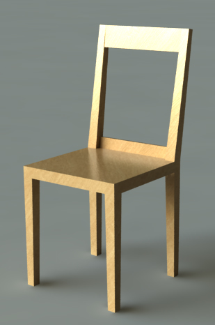
For this reason a chair like the one at right is (subjective matters like balance and unity notwithstanding) nothing special. Mathematically, it’s so basic that any one of us can shut our eyes and conjure up something very much like it. It has flat planes and straight lines and hard angles. It’s lovely in its simplicity, but it’s low-concept and doesn’t represent a lot of information in terms of design.
Compare this with the image of the Bone Chair above. The Bone Chair was designed to mimic an organically produced shape, so instead of simple, straight lines, it has wandering curves. But not just any curves: it’s not baroque, covered in useless frills. Instead the curves very closely follow a pattern mathematically determined for high efficiency. The result is something so complex that no human mind could arrive at it unaided, and in fact even a supercomputer couldn’t create a design like this in one swipe. Only through the repetition of generations of simulation can a computer produce the computational effort necessary to come up with a design so high in information.
And obviously, since the human mind is incapable of the calculations necessary, and computers have only arrived at this ability within the past decade or so, the Bone Chair represents a design so avanced that it would literally have been impossible to create even a generation ago. The principle of evolutionary design may be billions of years old, but doing it ourselves is a very recent accomplishment.
![]()
Artists often draw inspiration from their materials, pushing the limits of what the material can do to explore new forms, and altering their designs as they learn from the process of trial and error. This is not one of those cases. The manufacture of the Bone Chair was a relatively straightforward process once the design was created. In this case, the inspiration for the chair was a concept so far ahead of manufacturing that it was the design that took thousands of years to arrive at, while the material science needed was in place thousands of years ago.
 But as the idea of biomimicry advances, material science will find itself scrambling to catch up. The Bone Chair was not so large or complex that it couldn’t be cast by hand, but when contemplating the potential for hyperefficient, organic-formed design, the mind races so far, and so fast, that one wonders whether our ability to manufacture the designs we might come up with will ever catch up.
There’s the question of why we’d bother; the answer to that question lies in the problem of scarcity. Geometric designs like the simple chair above are easy to design, but horribly inefficient in their use of materials. Any plant or animal so profligate with its resources would be doomed to extinction. In the history of manufacture, on the other hand, the material resources have always been far easier to come up with than the design — or the method of manufacturing something as complex as the Bone Chair on a large scale.
But as resources become more scarce, and the ability to design complexity increases proportionally to the power of our computers, and the advances of material science allow us to manufacture things more complicated than was possible in the past, the emphasis on our resources will be away from conserving time and energy designing and manufacturing, and towards conserving the materials from which our objects are made. The sense of pursuing designs like the Bone Chair on a mass scale lies in the fact that design power was once a scarce resource, but one that is now becoming boundless — and the materials we use, which were once seemingly inexhaustible, are now becoming scarce.
To do more with less, we will need to maximise the efficiency of the materials we use — which will mean a slow but steady shift away from inefficient geometric designs and towards hyperefficient organic ones.
![]()
Imagine the inside of the fuselage of a huge international airliner. The airplane fuselage is one of the most complex objects — both in terms of design and manufacture — that we are capable of producing on a large scale. Modern airliner design is at the cutting edge of what’s possible — and yet, compared to the efficiency of the design of the Bone Chair, it’s lightyears away from its optimum.
Now imagine the inside of the fuselage of an airliner as designed the same way the Bone Chair was designed — a shape with no hard lines or flat planes, only organic curves and surfaces, and reinforcement arching across the interior where it’s needed. What would this airplane look like — an airplane designed not by the minds of human beings but by evolution?
Such a fantastic design would take efficiency and the ability to achieve both strength and lightness to a new level, transforming the look of everyday objects, but even our most promising techniques for making such a craft are a long way from achieving such a task. 3D printing and nano manufacture offer the tantalising possibility of being able to construct giant forms to any specifications, but for now, those remain just a dream. The economy of scarcity and abundance — of materials, and of our computational and manufacturing abilities — will determine how far we follow the path the Bone Chair has started us down.
